

Chaos isn’t just disorder; it is complexity waiting to be deciphered. When we decided to create the visual identity for the Chaos Team, we knew we couldn’t take the obvious path. We needed an image that represented the speed of cybersecurity, the depth of vulnerability exploitation, and the intelligence required to compete in the world of CTFs (Capture The Flag).
Here, we break down the deconstruction process of our logo and the hidden meaning in every pixel of our new brand.
The Color: Why Purple?
The choice of purple wasn’t merely aesthetic; it is a statement of intent in the Information Security (InfoSec) world.
- Red Team: Represents the offensive, ethical hacking, and exploitation.
- Blue Team: Represents the defense, protection, and incident response.
By mixing Red and Blue, we create Purple. Our identity reflects this Purple Teaming mindset: the ability to understand the attack in order to strengthen the defense.
The Symbol: From Vortex to Geometry
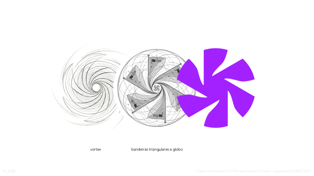
Our main icon was born from the concept of a “Vortex.” However, we needed to transform that chaos into a solid, vector form. The result is a symbol composed of several layers of meaning:
- The Vortex (Movement): The rotating blades symbolize the constant dynamics of the internet. Like a hurricane, cybersecurity is never static. It represents “vulnerability exploitation”—going deeper and deeper into the system.
- The Flags (CTF): The geometry of the blades reveals triangular flags in circular motion. This detail is a direct homage to Capture The Flag competitions, the team’s fundamental modality.
- The Globe (Internet): The circular arrangement suggests the shape of a globe, representing international connection and the vastness of the World Wide Web where we operate.
Typography and the Empty Set
For the textual logo, we chose a modern and robust font. But the crucial detail lies in the letter “O”. We used the Empty Set symbol (∅) or the “slashed zero.” In concept: It represents the “empty space” in the eye of the hurricane, the point of silence amidst the chaos, where information is decrypted. In code: It distinguishes the number zero from the letter “O,” which is essential in programming.
The Web Experience: “Access Granted”
Our visual identity wouldn’t be complete without the digital environment where it lives. Our site was designed to evoke the sensation of opening a “Confidential File.”
- Retro VHS Vibe: A homage to the golden age of analog hacking and phreaking.
- Email Box / Internal Files: The navigation simulates access to a secret organization’s internal file system. We want the user to feel like they are “entering the system” rather than just visiting a webpage.
The Final Result
What started as an abstract idea of “chaos” has transformed into a solid brand. Chaos Team now has a face that reflects its mission: to navigate the data storm, capture the flag, and protect the system.
The materialization of this visual identity was a process developed entirely within NEI-ISEP. The conceptualization and lead design were handled by Ricardo Meireles (Image Department Coordinator at the time), with support and creative collaboration from Catarina Lima, Carlota Lemos, Bárbara Ferreira and the team captain Gonçalo Sarabanda.